Studying Icons
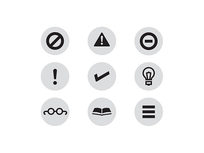
Icons for pullout boxes in a book I'm designing about studying in the USA (from a foreign perspective). Top row are options for 'Warnings', second row for 'Tips' and bottom row are for 'Further Reading'.
Any thoughts?
More by Owen Jones View profile
Like
