Quora Redesign
Hola Amigos!
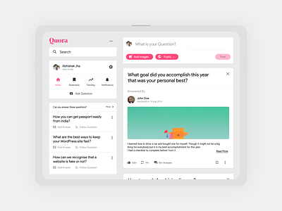
Today I would like to share this redesign of the Quora tablet site I did a while ago. My goal here was to bring important elements together, make the IA less ambiguous and overall design pretty.
As you can see all the main actions are on the left side and main content on the right side. In the current design, different actions are scattered and significant actions are hidden under a menu. I aimed to solve those issues with this redesign.
Tell we what you guys think?
More by Abhishek Jha View profile
Like
