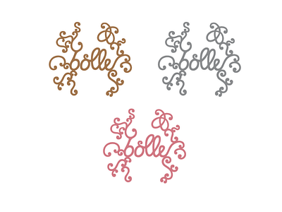
Bolle Logo – Colors
After days of work the Bolle Fine Bakery Logo is finished! As with all of my work the concept for this logo was started on paper with an analog sketch. After that, I redrew the logo digitally using vectors.
The challenge for this logo was to create an image that honors the sophisticated art of fine traditional baking and at the same time is very minimal in its outline and coloring. This logo stands for a refined craftsmanship and a family business that is traditional yet up-to-date.
More by Anne Pflug View profile
Like
