Status Modals UI
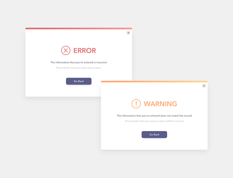
These are 2 simple status modals that can be quite versatile in terms of usage!
🔸Here you can see 3 levels of typography hierarchy:
1) Header - color indicates status 2) Status description 3) Hint to help user bypass the error/warning
Adding a hint to a status modal helps direct the users towards their goals!
🔸Buttons should stay consistent with the application's theme or design system.
🔸I've added a top bar in order to differentiate the statuses with colors. Seeing this can help users immediately associate the modal with the corresponding status