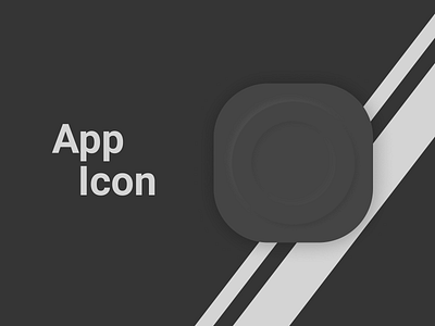
App Icon
Actually re-uploaded this one because I got lazy at presentation but it was really bothering me, so I added font and the two lines behind the icon to give it some perspective.
Way happier with this result, also, kinda delivering quality neumorphism, but still strugling with contrast.
More by Orlando D. Luna View profile
Like
