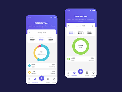
Money manager app - part 2
Hey everyone,
These the other two screens of the same app I shared in my previous post.
I got a suggestion from @Robert Zygmuntowski to use white for the bottom navigation and it does look better! Thank you so much for the advice Robert!
———— ❤️ Hope you like this guys! Feel free to share feedback and comment. Thank you!
———— 🙏 Follow me on Instagram
———— 👩💻 I am available for new projects. Just drop me a line at: andreeeatheodora@gmail.com
More by Andreea Theodora View profile
Like
