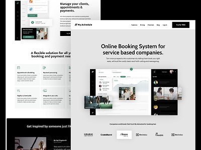
My Schedule | Homepage
Hey Dribbblers!
A bit different approach for the homepage for My.Schedule (Online booking service). This time we chose a more minimalist approach in the colors and the layout. By using full-width custom illustrations for the software in the "above the fold" section we aim to give the visitors a clear picture of the features that the dashboard has.
About My.Schedule
My Schedule is an online booking platform for service-based companies. The software has really powerful features, it's intuitive & easy to use, mostly focused on scheduling clients for services, scheduling group activities and processing payments and sending reminders.
We were tasked to help them achieve brand clarity. To clearly state its features and nicely explain how easy is to use the tools. With the very simple user interface, minimalist approach and focusing their tool to very specific niche markets, to show specialization and expertise. This is the first iteration of the landing page design, more to come soon.

