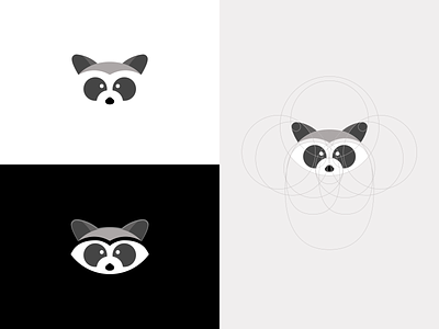
Raccoon Logo Icon Design Exploration v1
A new project coming up for a new client and he decided to go with a raccoon as mascot.
Now this is my first tryout using the circle technique to perfectly execute a logo and I'm really happy with the results so far 😎
Also, I've been struggling to find a way so the raccoon can be placed on ANY background without worry about negative space or colliding colors that's why you see that white border (with 40% opacity) at the top of the ears 😉(slide to next page to see what I mean)
Liviu Anghelina - Senior Product Designer
Self-taught Product Designer and Web3 Enthusiast.
Get in touch
More by Liviu Anghelina - Senior Product Designer View profile
Like

