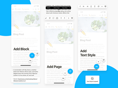
Notion App Redesign - Case Study
Hello, guys!
This is the concept of redesigning the Notion app for iOS.
Recently I noticed several UX issues that frustrate me as a user. This is a lack of shortcuts for adding a new block, especially to-dos (since I use the Notion for managing my weekly to-dos).
To prove my suggestions, I have conducted small UX Research. After that, I designed several UI solutions to most mentioned UX issues of the app.
You can check my UX Case Study on the Medium: https://medium.com/@mrshell06/notion-ios-app-redesign-zero-cost-ux-case-study-for-the-app-for-taking-notes-98e6b0f43437
Do not hesitate to share your opinion :)
Thank you for your attention!
Have a beautiful day!
More by Olena Horbachenko View profile
Like
