Toast notifications
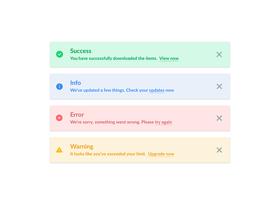
Some toast notifications that I made for fun. Played around different color combinations and landed on this palette. Even though this was only four components, it took a lot of tweaking. Makes me realize that building a whole design system can take awfully long, especially when components have to scalable and accessible.
Not sure if this is still the best readability though. Thoughts?
More by Karen Ko View profile
Like


