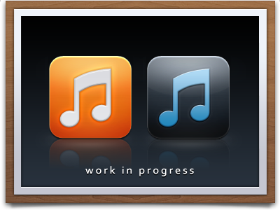
iTunes App Icon 2
A few different Ideas. The blue Tune on the right was made slighter more saturated than usual. Im fed up of seeing the same old, tired gradients everywhere lol!
More by Craig 'iPhaze' Philips View profile
Like
