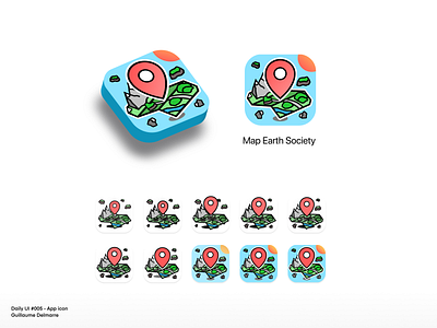
App icon - Daily UI #005
D-95 until the end of the challenge.
I wanted to design something a bit unusual for a navigation app icon, which would not only only be a pin or a minimal map, and bring a bit more colors and fun into it. In the end, maybe it looks a bit too much like an icon for a mobile game?
That's an interesting exercise anyway. I had quite a few iterations along the way, playing on the number of details, width of the strokes, size of the different elements, as well as the colors. Not an easy task to keep it easily readable once resized. I will go back on it when I improve my skills.
More by Guillaume Delmarre View profile
Like
