bigfoot construction supply business cards
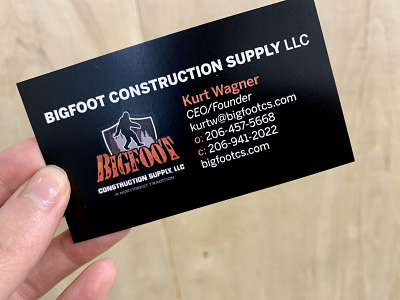
While a blocky stencil or slab serif is common in construction type, I opted for Benton Sans as a bold and clean type, like their website. The font is also seen on their site which felt like a very appropriate choice. The thick lines to the left help group together the contact information for the person apart from the contact information for the company as a whole. I kept the logo on the back to give it a big bold presence on its own, plus the tagline was already there on the logo file when I placed it in so I didn't need to add it. With the contact information left aligned next to the logo it made it seem simpler and easier to read, even though I didn’t change the amount of information. Adding the orange as a highlight color instead of a main attraction made it seem purposeful and bold.
