BMF! #08 / BMW
Maybe I have been too far ?
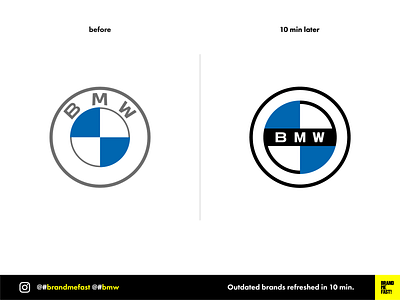
I am not a big fan of the new BMW logo. I think they tried to make something new without getting rid of the constraints of the old. I find it unbalanced on the bottom and not consistent with those different strokes thickness.
Ultimate solution would be to get rid of the name and the outer circle. A brand like BMW could do it.
But I wanted to play a bit and explore something with more balance while keeping the name.
What do you think about the new BMW logo ?
FULL POST
www.instagram.com/p/B9hV8ZEgEIY
BRAND ME FAST!
www.instagram.com/brandmefast
@brandmefast
