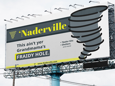
'Naderville Tornado Shelters (Billboard Design)
‘Naderville Tornado Shelters Billboard Design
Challenge:
Create a billboard design for a local tornado shelter company.
Process:
Understanding that a billboard has, at best, 7 seconds of readability time, I used strong graphics and bright accent colors to catch the eye and a bit of humor to maintain attention and interest. The website is also quickly retained to memory due to the yellow highlighted lower section and name consistency.
End Result:
A bold advertisement that any storm-prone local (and more!) will be sure to notice and recall. More importantly, more people will be safe as the inevitable storm seasons approach.
More by Julia Clayton View profile
Like

