DR-2 icon refresh
Im currently working on the new Ui for DR-2. I really want to make the update feel like a natural progression as opposed to a completely new product. One of the ui details I was keen to keep where the colourful icons.
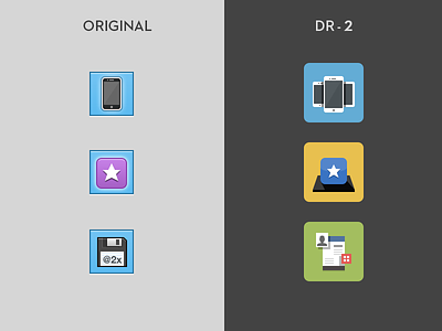
On the left we have the original DevRocket icons and on the right the new look DR2 ones. I think the new icons look really refreshing in comparison, what do you think?
More by Norm View profile
Like
