The Nature Place — 2 𝑜𝑓 6
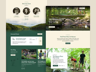
The Nature Place Day Camp’s user interface relied on an earthy color palette with lots of tans and greens. We had a lot fun with the typography by pairing the sophisticated Alegreya for our headlines with the playful Gaegu for pre-headers. Cards and buttons were given rounded corners for a soft and approachable feel. We also created custom hand-drawn style illustrations throughout our designs to elevate the branding even more.
You can peep the live site here: www.thenatureplace.com!
More by 829 Studios View profile
Like


