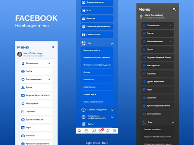
Facebook Hamburger menu
Dribbble | Instagram | Behance | Telegram
In my opinion the hamburger menu is not very good, because there are too many colors. Those are nice, but the combination is not right. Too strong gradient background, and too light boxes are not comfortable. I also don't like its UX, that's why I created a simple list.
So I decided to create 3 versions:
-Light,
-Blue,
-Dark.
More by Eva Harutyunyan View profile
Like
