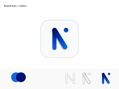
Community Network Logo
This logo is designed for the community for a distance-education platform.
The idea behind this logo is to make it “responsive”, which fill fit on a website, but also right away in an app icon and marketing materials.
The logo is supposed to be an “N” for “Network”.
Would love to hear your thoughts! 🤭
More by Carlo Sky View profile
Like
