WIP sneek peek 👀 - accounting firm homepage
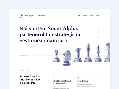


A little something I've been working on lately. The client is a small accounting firm that uses chess, and especially the knight piece, as a visual metaphor.
I'd love to hear your feedback. What would you do differently? Different font? Different alignment? Different color palette?
Photography is missing here because the client doesn't have any, and is reluctant to show themselves publicly. It's an interesting challenge to design only using simple illustrations and type.