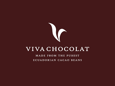
"Viva Chocolate" Logo Design
Been playing with more 'natural' shapes to represent the initials.
Certainly don't want to fall into the visual cliche of plants/leaves yada yada, so trying to tread this fine line between natural/organic and the typographic brush/calligraphic style from which this evolved from.
It's possibly leaning a little too far towards the gentle moving leaf than a free flowing calligraphic/brush stroke right now, but been staring at this for far too long right now. :)
Important to note that Viva Chocolat is not a consumer chocolate brand, but instead, a "couverture" chocolate brand: supplying pure and high quality chocolat to the food industry etc.
Also attached 2 variations of the initial V in a general typographic style.
More by Smitho.graphics℠ — Logo & Icon Design Studio View profile
Like


