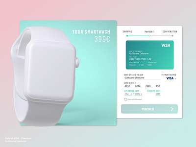
Credit Card Checkout - Daily UI #002
Here we go for the second day of the DailyUI Challenge! A credit card checkout page.
Designed on Figma again. Trying to play with gradients, while keeping a clean overall aesthetic.
I had a really hard time to try matching fonts, and I am far from pleased of the result, but it's still better to put this design out there, move on, and improve on the next one, 1% by 1%. So if you have any advice on how to best use and pair fonts, you are really welcome :) If I had to improve something else, I would probably add more white space on the payment form part.
(Disclaimer: the Apple Watch 3D model is not mine, it is coming from lstore.)
More by Guillaume Delmarre View profile
Like
