Harmonelo
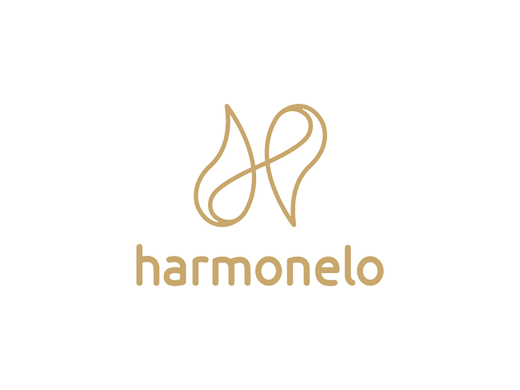
Logo symbol consists of two drops - it's basically divided and reconstructed symbolism of yin yang - to make harmony. And drop shape 'cause it is all about healthy drinks.
In middle of these drops is line which makes it all together in one handmade letter "H" as a name of brand.