Weekly app performance report
This was part of a re-design of a weekly performance report that New Relic sends out to customers.
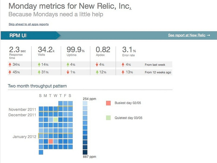
Included is a throughput / calendar visualization (essentially traffic, in average page views per minute) that helps show patterns in your traffic over the week and months. The visualization itself was actually coded first (as a proof of concept, and to determine if it was viable with real-world data) and then cut-paste into the final mock-up with a few smalls tweaks.