Gabby
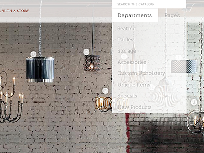
This is a over simplified navigation menu. The client had a ton of links they needed to put in the top area. There just wasn't enough space, so I created this simple dropdown menu that allows us to hide menus until they're needed. That lives the user three main options for how they want to navigate the site: search box, by department, or static content pages.
The slider below also allows for easy entrance into the catalog by using clickable hot spots linking directly to products.
More by Andrew Searles View profile
Like
