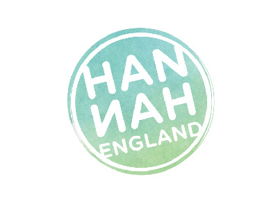
Hannah Logo
I'm working on a personal rebrand and I need some feedback on my proposed new logo.
I wanted something that was structured but still playful, something that could be made into a stamp (I'm planning on hand-stamping my business cards), and that hinted at my illustration background but wasn't "illustration-y" because it needed to be simple enough not to conflict with self-promo illustrations and designs. I tried making the logo rougher but it started looking grungy (which isn't my personality) so I settled on varying the line thickness around the circumference of the logo. I chose Gotham Rounded as the font because it's clean and has rounded letters that echo the circle.
Thoughts, feedback, suggestions, etc. are appreciated. What kind of personality does this show you? Do I meet the goals I mentioned above?
