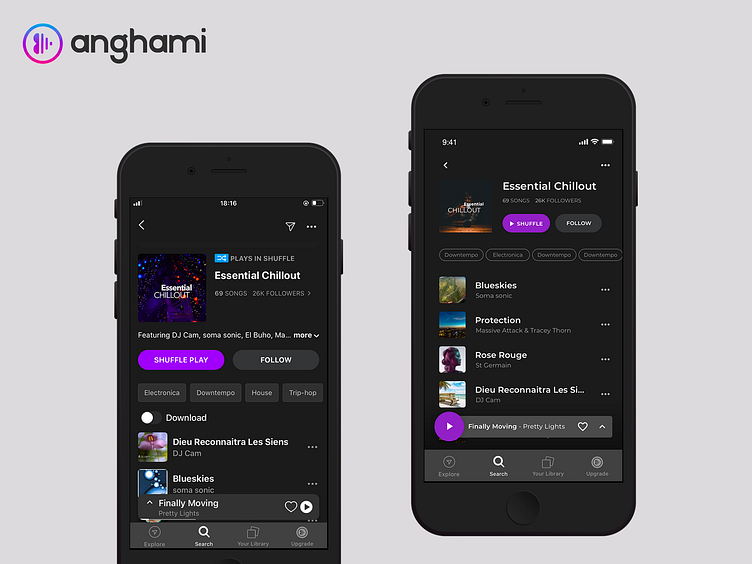
User Experience Optimization - Anghami App
#uxdesignfrustration #anghamiapp
That feeling when you are a designer and you are always bothered by a feature you use daily and you decide to take action into doing something about it.
This project towards the Anghami App has a main focus of making the user experience of the PLAY button better (right one being my version) as well as other small features like hiding low priority information offering more room for the playlist. As you can notice on the official (left) version the PLAY and FAVORITE buttons are so close together let alone their hotspots (trappable area) having in mind that they are not in the same priority.
This is a personal action I took on this screen, so please show me some love since I am willing to tackle other screens in the near future as well as the car version so let me know your thoughts on the comment section below.
Thank you!
