BMF! #07 / Ville de Dijon
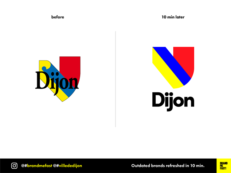
Dijon is the French city where I grew up. Since I was born I only know the old logo. I have seen some attempts to refresh it but it was always very shy and didn’t really fixed the problems.
My first decision was to separate the name and the glyph, which previously caused many problems of legibility, depending on the background color. I then based the design of the glyph on a perfect square divided by 2 columns. It gives the element more consistency and can be easily reusable for other compositions in the identity.
I brightened the colors to give them more energy and taste. Dijon is a very dynamic city and food is really tasty !
The overall rebranding is also much more suitable for digitalization.
It is time for the new generation to take over the city !
FULL POST www.instagram.com/p/B9YxyOdAGpe
BRAND ME FAST! www.instagram.com/brandmefast @brandmefast
