Logo build upon each other
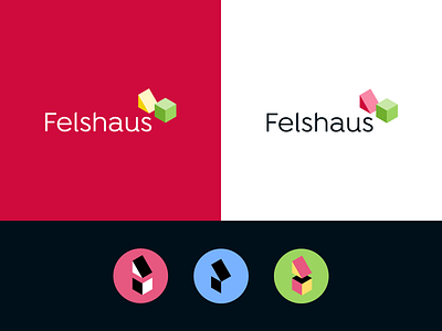
This is the last unused draft for a holiday cottage focused on youth work, camps and seminars - generally more appealing to a younger audience. „Felshaus“ means translated „house on a rock“.
Cube and prism symbolize the roof and the rock, but also different individual people who can complement each other to form a whole, a unity and community.
The used geometric font „Isidora“ complements the objects, but also radiates something friendly and soft through the curves. The upper corners of „l“ and „h“ were cut to follow the same isometry.
The geometric objects themselves can also function as patterns in different cuts and compositions, detached from the logo.
