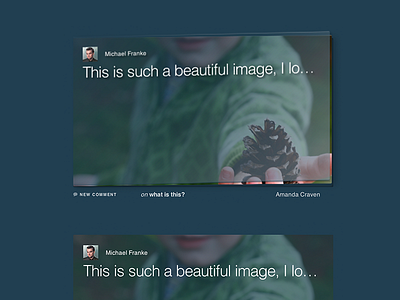
New Comment Hover State
Continuation of the last post - taking the slight raise theme and adding a comment overlay for full feed. Again, entirely CSS3.
Still very disappointed at how poorly browsers render text when making CSS transforms. These shots are from a retina display, so it's even crisper than most people will see on a normal resolution display.
More by Chris Lackey View profile
Like

