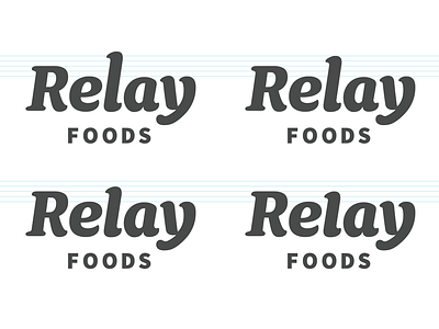
Relay Foods - Short L
Aside from the notes on the terminals others have made the one thing that really stood out to me was the height of the L. It worked in the previous version, but to me the simpler L in the new logo seems out of place.
Here are a few different heights for the new L. I like the bottom left the most.
More by Nate Tharp View profile
Like
