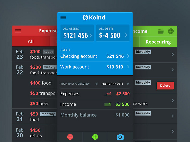
Finance tracking app [wip]
Working hard on this project.
I decided to color code each section of the app according to its purpose. Blue for neutral sections (dashboard, assets), green for income, red for expenses. It distords the branding a bit, but I am not a fan of heavy branded iOS apps anyway.
What do you think? Let me know. Checkout the @2x.
More by Pavel Maček View profile
Like
