Dunkin' Donuts Coffee Advertisement Layout Design
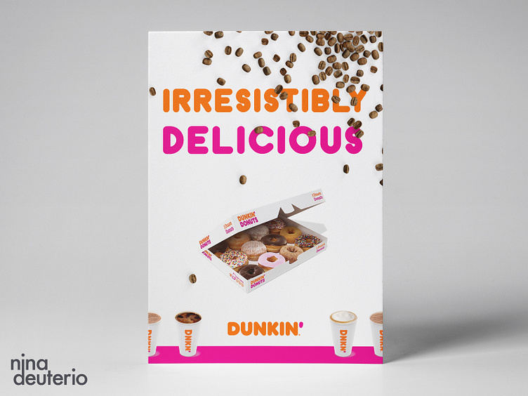
Dunkin’ (or as us New Englander’s call it - Dunks), is such a bold and distinctive brand from a visual perspective. Not only does their typography have a unique personality, their colors are vibrant and audacious as well.
— The coffee beans add a point of interest while balancing out the overall color of the composition. They compliment the colors in the coffee cups and the neutrals in the donuts to slightly tone down the energetic colors. Day 13/30 - Lyout Design Challenege
