BEFORE and AFTER Kennesaw Junk Removal
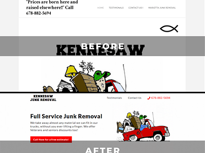
THE GOOD (BEFORE)
The previous design had a solid use of white-space. It explained what services they provide, their Veteran and Senior discounts and how to get in touch with them.
THE BAD (BEFORE)
The "Prices are born here and raised elsewhere" quote is confusing. "Marietta Junk Removal" and "Kennesaw Junk Removal" is also confusing because those are two different cities and they have one location. No address on their website, I found their address on Google. The "Hero Image" is too large and places the important, attention-grabbing, copy out of immediate view. The fish has no relevance to the content. Call To Action button is at the bottom of the page. What urges a user to call are the Veteran and Senior discounts and that's below the first two paragraphs.
AFTER
I designed the new homepage to urge users to call for a free estimate. The headline tells the user Kennesaw Junk Removal can remove anything for them. Call To Action is prominent and displayed multiple times on the page. Testimonials are easier to read and easier to find. This way, the user can find social proof about Kennesaw Junk Removal immediately. The address is present and a email form to get subscribers. Design is mobile friendly and responsive across multiple platforms.
DISCLAIMER
*THIS HOME PAGE IS A CONCEPT AND IS NOT THE CURRENT WEBSITE*
To see the web page live go here:
https://kennesaw-junk-removal.webflow.io/
If you would like me to build your business a website or redesign your old website, please go to:
https://www.thompsonconcepts.net/
Follow me on Instagram:
@thompson_concepts
https://www.instagram.com/thompson_concepts/
