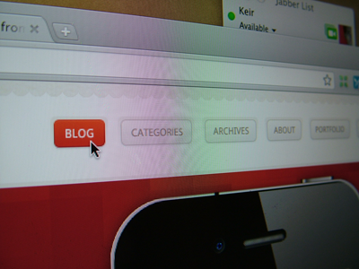
KeirAnsell(dot)com 4 Preview
Well a lot of people I follow on twitter have been dribbbling in the last couple of day's so figured I should join in really.
Continuing with the dark theme for the majority of my site but did debat going with a light design.
End result, light design for the blog, dark design for the rest.
And I love seeing photo's of UI's rather than screenshots, don't really know why, maybe realism, but anyway...
More by Keir Ansell View profile
Like
