Mobile Empty States
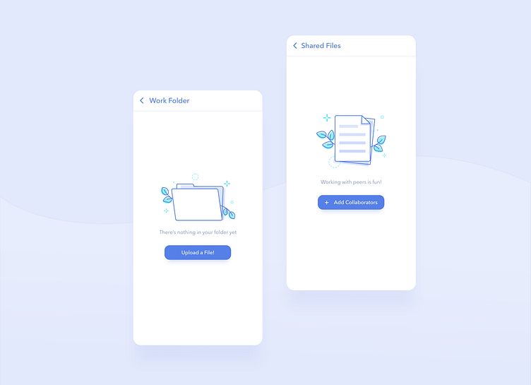
Empty states are little rewards you get after finishing all the core designs of an app 😄
But that does not mean they're just there to look pretty! I've seen plenty empty states that made me wonder: - Why am I here? - What am I supposed to do? - Where am I supposed to go next?
It's nice to include fun visuals into an app, but it should also serve a purpose!
🔹Empty states are meant to inform, and therefore, should help direct users to a start a task or take an action. 🔹It also helps if there's a description to explain why users are seeing this screen! 🔹I try to keep the colors and visuals consistent to my app's branding. 🔹I often make the illustrations a bit lighter and slightly muted to indicate that they belong in the background. This helps users avoid thinking that they are buttons or main UI elements. 🔹I tend to keep things minimal; we're making an "empty" state, not a full hero 😆 .
These were so fun to make! I hope to create a series of illustrations in this style 😊