LittleIpsum Mockup — Animated
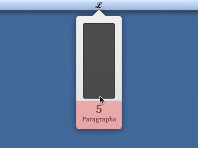
I tried to take on board Grant's criticism. Hopefully this makes these features easier to access, but means they aren't given equal importance with the text selection menu. Dashboard widgets have a similar UI with the i in the bottom right. Obviously the animation is just a rough outline. Thoughts?

