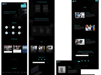
Blue Gorilla UI
The client asked for a website redesign and specified on the aesthetic approach. The dark theme is meant to highlight the blue highlight throughout the website. We put the website in a matter of two days. We think it suffices, but could do with more layers, particularly with extending the tropical theme the client suggested.
More by Frecle View profile
Like
