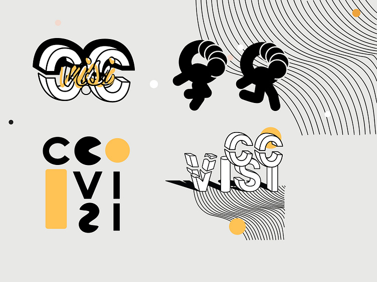
C.C. VISI Logo exploration
I created a brand identity with a modernistic and linear approach for C.C. VISI.
The inspiration for the colors of C.C. VISI comes from their sound. Along with a support of metals to support contrasts. I also used brights to alternate the mood.
It is an ultramodern and minimal branding / packaging project.
More by Paulina Wisniewski View profile
Like
