Lets Go On A Tour Logo Final Design - Designrar

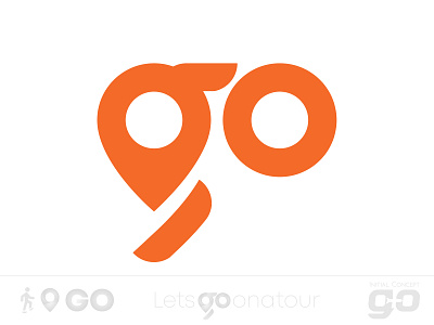
Letsgoonatour is a travel agency. The client needed a logo based on their company name with emphasis on "GO". They needed a logo that look modern appealing to people of all ages.
Out of a few concepts, they choose this logo. When you take a look at the logo in first glance, you simply see two things, location icon + go. However, the the hole through O, and location icon also gives a feeling like you're looking out through plane windows. Little line under location icon not just makes it "g" but also, if you take a look at the negative space on very left and the line, it looks like a step taken.
Initial concepts and complete project is available on Behance:
https://www.behance.net/gallery/93076289/Letsgoonatour-Logo-Design-Initial-Concepts