AGDA design seminars

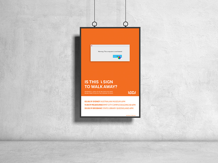


I was provided with a brief to create seminar posters and accompanying Instagram posts that would draw design students to attend and learn more about certain business aspects of the industry. My concept was to use a simple message that would draw in the target audience, and keep text to a minimum as to not lose attention. Everyone encounters an ‘error’ message on their computer and by creating a ‘tagline’ to accompany the pop up messages you get a brief understand of what the seminar is about. I also used the distinctive, recognisable colours that AGDA uses consistently through their website and other media platforms to tie back to the branding.
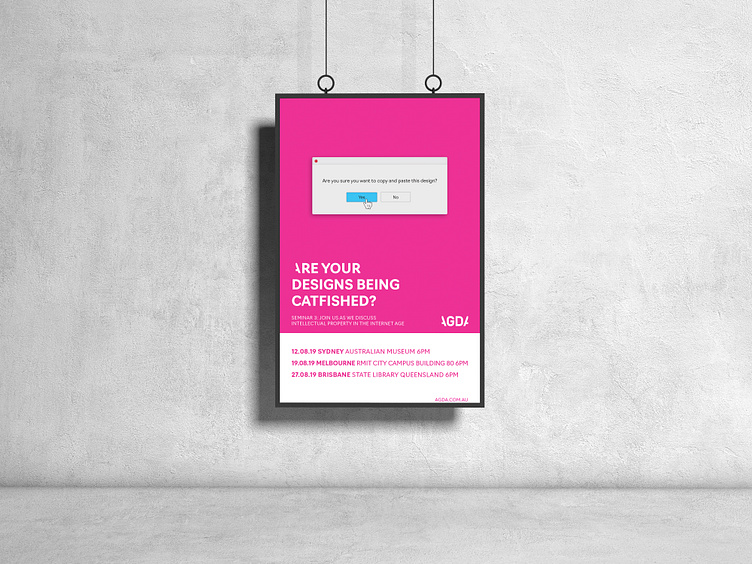
I was provided with a brief to create seminar posters and accompanying Instagram posts that would draw design students to attend and learn more about certain business aspects of the industry. My concept was to use a simple message that would draw in the target audience, and keep text to a minimum as to not lose attention. Everyone encounters an ‘error’ message on their computer and by creating a ‘tagline’ to accompany the pop up messages you get a brief understand of what the seminar is about. I also used the distinctive, recognisable colours that AGDA uses consistently through their website and other media platforms to tie back to the branding.
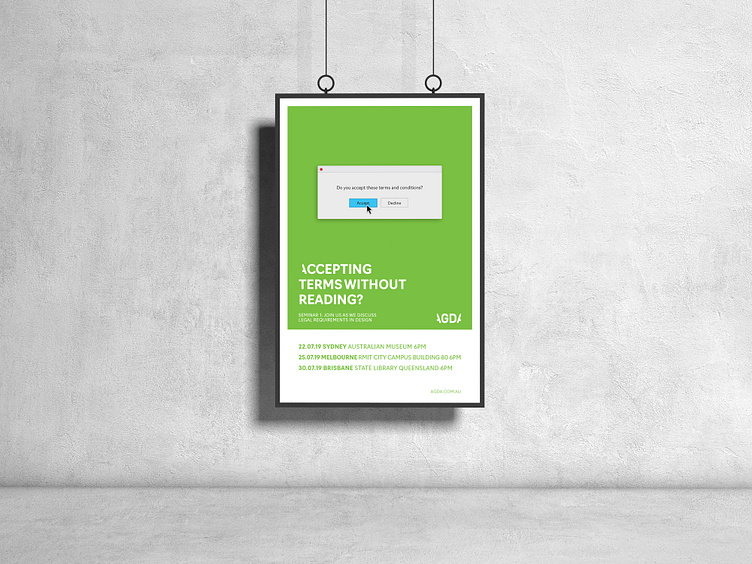
I was provided with a brief to create seminar posters and accompanying Instagram posts that would draw design students to attend and learn more about certain business aspects of the industry. My concept was to use a simple message that would draw in the target audience, and keep text to a minimum as to not lose attention. Everyone encounters an ‘error’ message on their computer and by creating a ‘tagline’ to accompany the pop up messages you get a brief understand of what the seminar is about. I also used the distinctive, recognisable colours that AGDA uses consistently through their website and other media platforms to tie back to the branding.
