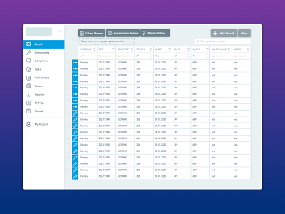
Aviation Maintenance dashboard
Need help!!! I have decided to share with you my second aviation project WIP (logo covered sorry, I was secretly asked to help this company bring their dashboard to the next level). Why am I sharing something unfinished? I want a chat with you guys cause this one is NOT so easy😅
This is an aircraft maintenance dashboard app which is used mostly by people who are 45+ and wear glasses. They don’t want to see small buttons, they need bigger buttons. You can’t reduce font size to less than 12 anywhere - they complain it’s not visible. But you have huge data amount.
Please share your experience designing dashboard apps with big amount of data for audience of older people🙏
👍🏻what to consider?
👍🏻What were your best practices?
👍🏻What didn’t work and why?) You can see how it looked before my first concept by swiping carousel. ✅I have grouped actions into primary and secondary.
✅you can see I’m still determining what icon is best for row action but that’s in process.
✅manipulation with table columns was very unclear so I brought main customization options from being hidden by right click to being seen right away
✅ there were duplicating actions (see a lot of icons in Before picture) - grouped/solved/hidden
Will love you forever for the advice 🤗


