ZipCar Advertisement Layout Design
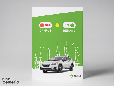
I was inspired by the “on” and “off” toggle buttons to visually depict the option to book a ZipCar on their app. Since the green naturally coincides with Zipcar’s branding, I thought of ways to incorporate a traffic light.
This was accomplished by simply inserting a yellow circle in between the red and green buttons. Not only did this work out well for layout design, it also adds another layer graphically - a sun in the cityscape skyline.
(Day 12/30 - Layout Design Challenge)
