Samsung logo
Samsung logo redesign concept.
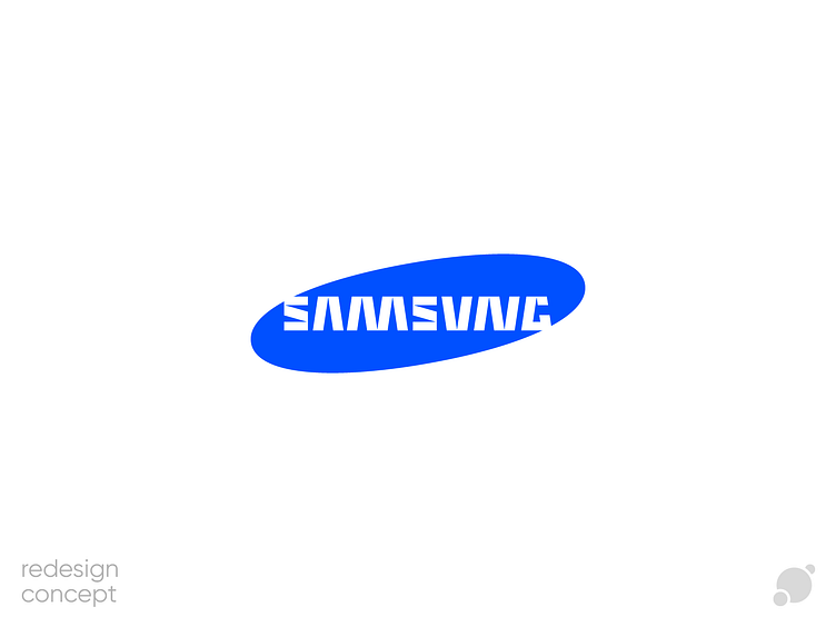
As a basis, I took the letter A. It does not have a crossbar in the original Samsung logo. Therefore, it looks quite stylish and technological. I decided to build a logo from the same elements as this letter.
Portfolio and other social networks:
Telegram | Instagram | Behance | Vkontakte
My email: antipslava.design@gmail.com

