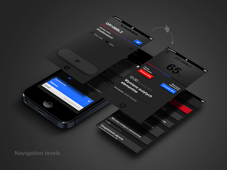
App navigation levels
I'm working on the last TurboDoktor app elements. This time you have here a simplified (I skipped few screens) app structure - navigation levels. There are four the most important screens of the app which would be arranged in this order.
@2x is strongly recommended :)
Feel free to leave comment.
More by Karol Ortyl View profile
Like
