Autocompara | Responsive Web Design
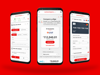
A sample of the redesign of autocompara.com on mobile devices, I worked on reducing the average time it takes to finish the happy path and increase conversions, with simpler, clearer and informative instructions to help users, persuade them and save them some time, I worked on gradual and iterative changes in the user interface to be comfortable for the eye, for example; the excessive use of red was reduced and is now used only as an accent color, the size of the fonts were increased to facilitate reading to our older clients (and those who spend a lot of time on the screen) and all corners were removed using rounded edges with soft shadows.
