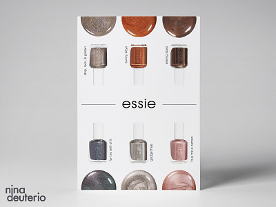
Essie Nail Polish Advertisement Layout Design
Too many extra visuals in advertising campaigns can diminish the impact your products present to the viewers. Embrace the beauty and uniqueness of your product with simplicity. My take on an Essie ad to highlight their polish colors.
(Day 10/30 - Layoput Design Challenge)
More by Nina Deuterio View profile
Like
