BEFORE and AFTER Family Med and Urgent Care
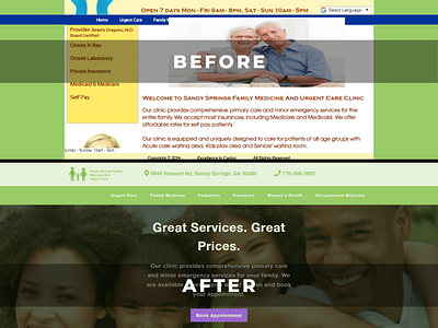
THE GOOD (BEFORE):
The previous design has did a great job of explaining what their practice provides and where they are located.
THE BAD (BEFORE):
The design is confusing because the elements are jumbled together. There is too many colors as well. The design is not mobile friendly. Most importantly, there is no Call To Action on the web page. There is nothing on the web page that urges the user (a possible patient) to call or setup an appointment.
AFTER:
I designed the new homepage to urge a potential patient to call or book an appointment online. The headline gives the user's entire family a reason to visit. The Call To Action stands out and is displayed multiple times through out the page. There is patient testimonials to build trust. A doctor bio is present (to build more trust). There is a contact form for after hours or if the user does not have an urgent request. The design is mobile friendly.
To see the web page live, go to:
https://sandy-springs-family-med.webflow.io/
*THIS HOME PAGE IS A CONCEPT AND IS NOT THE CURRENT WEBSITE*
If you would like me to build your business a website or redesign your old website, please go to:
https://www.thompsonconcepts.net/
