Teeny Tiny Sign in
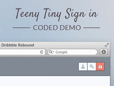

So I was looking for a nice design to code up and play with at the weekend for fun. I love Oykun's work and wanted to code up the original to this shot.
I started tweaking and making changes to it and added some new elements. It's not the finished article, it's just a quick demo/experiment to prove/disprove a concept.
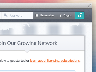
The idea being that there's no more work involved for the user, no additional steps or buttons, they still click on the username and start typing straight away. If they head straight for the submit button (which is disabled until the details are entered) a warning pops up.
I don't think this would be an ideal concept for mainstream sites but could maybe work on more techy/web savvy sites.
Played with a nice custom checkbox and some styled in tooltips. Button changes on entry of username and password too.
Thought: One concern I had was placing the forgot link inside the form. I think it should keep it's same position but probably be always visible. I kept it inside in this demo to make it extra teeny tiny :)
Check out the full screen attached.
Or to see what the heck I'm talking about visit... dvdhil.co/teeny
Thoughts appreciated.