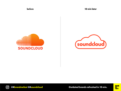
BMF! #06 / Soundcloud
Soundcloud's logotype is not among the worse on the planet but it hasn't been refreshed since ages. I don't even talk about their user experience which in my opinion has always been terrible, no matter the huge amount of feedback from the users. As a music producer I stopped a long time ago my Pro Plan as they seemed to never focus on the artists but more on the listeners' side. I am even surprised that they still have a community.
I based my redesign on the statement that in 2020 everybody has ever heard about soundcloud, they don't need to be introduced anymore. I took as referrals the recent brand redesign of Tinder or Mastercard. My first one completely got rid of the name to keep just the glyph, making the brand very iconic. My second got rid of the lines in between the two circles because they know they don't need to show that they are making a card business, it is written in their name !
I decided to simply go with the shape of the cloud itself and incorporated the name inside. It gives the brand more strength and it saves space. The glyph (simple cloud) can be used alone, but always with the brand's color. This is the combination of both that makes the brand recognizable.
FULL POST
www.instagram.com/p/B9G2BlCA3pg
BRAND ME FAST!
www.instagram.com/brandmefast
@brandmefast
